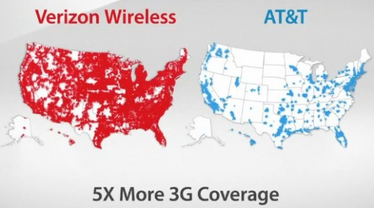
AT&T is suing Verizon over their there’s a map for that ads. AT&T is of course reacting poorly to a clever and powerful advertisement, but I understand their concern.

This is an intentionally misleading use of a map. Not only did Verizon pick a color for AT&T that’s difficult to see compared to the background, they are emphasizing total area covered, not total population covered. This is the same travesty you get when you look at 2004 election maps of red vs. blue states where it seems like the entire country is red when in fact it’s not the land that’s voting but the population.
Compare AT&T’s map to a map of population density:

Notice how AT&T has service wherever there is any significant amount of population? They retort that they have 3G service available for 296 million customers. So they’re claiming they offer 3G service to 96% of Americans. I suppose the obvious question for Verizon is why are they spending so much time and money extending a 3G network to that remaining 4% of the population that is geographically dispersed, and where they’ll get such little return on their investment? Verizon isn’t in the game for community service, they’re in it to make money. If I were a shareholder, I’d be rather concerned, especially considering that Verizon will have to update their network. And that they have crappy phones.